Menu
About Me
Welcome to my portfolio page!
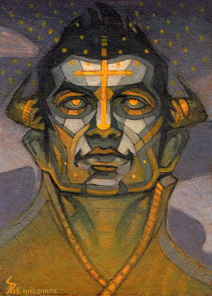
At Night
highlight
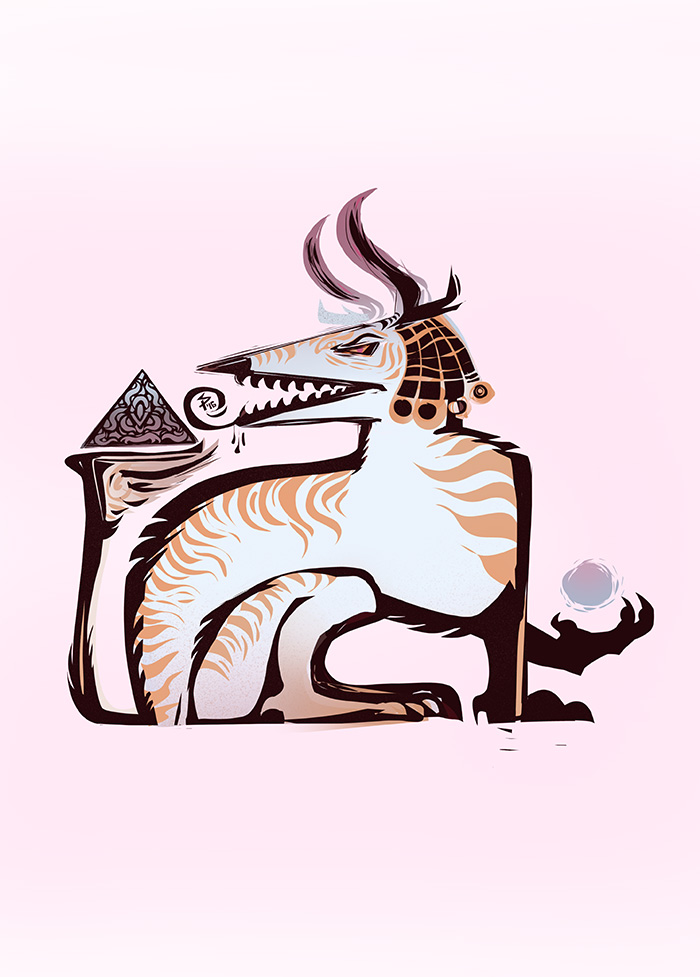
Dragon
highlight
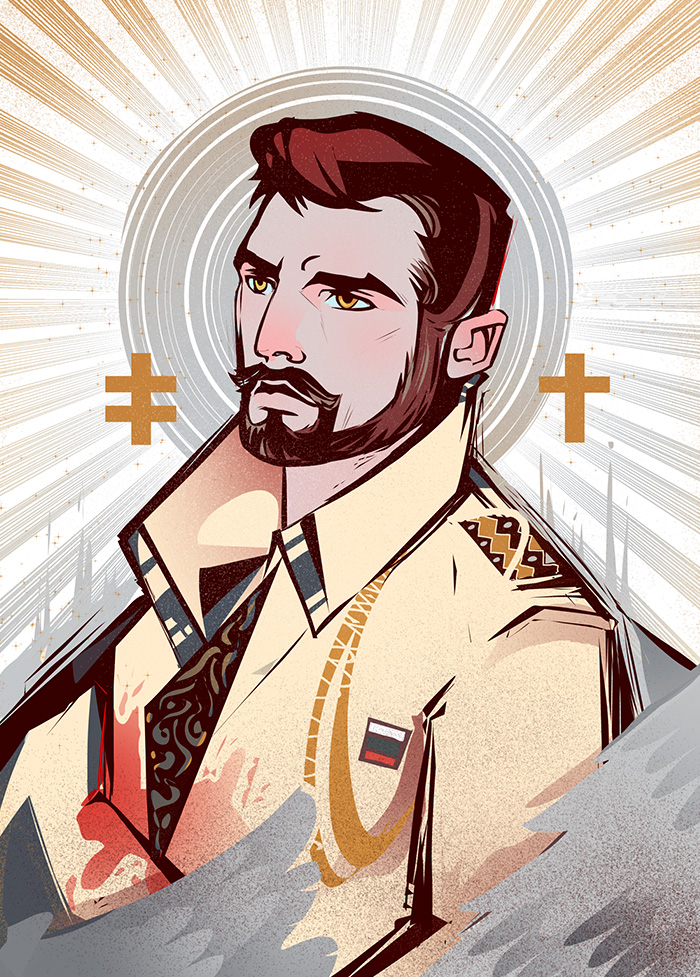
Hero
highlight
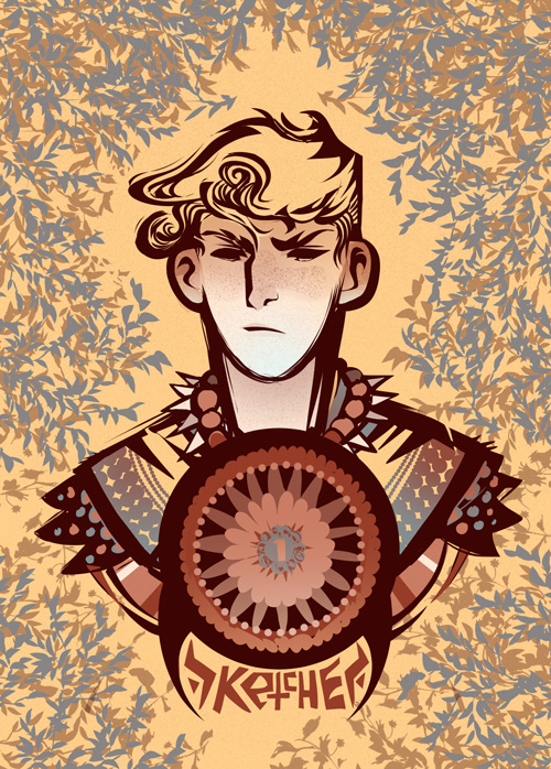
Cover "Sketchbooklet"
highlight
For Fur's Sake
highlight
Commissioned Work
highlight
Ronin
highlight
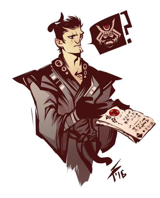
Based on "JoJo's Bizarre Adventures"
highlight
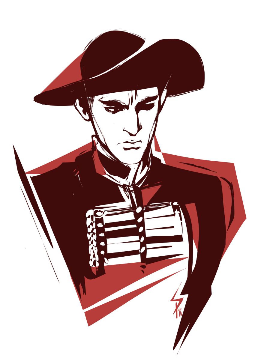
The Masked Bandit
highlight
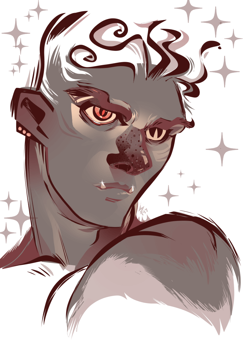
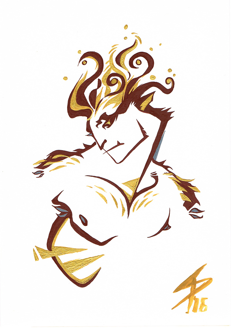
Beast
highlight
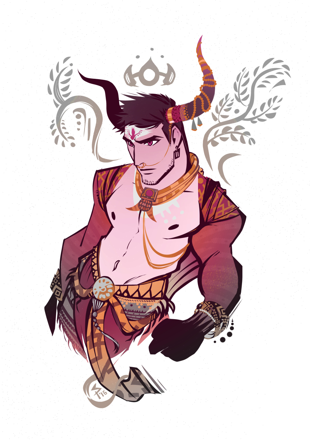
Egyptian God
highlight
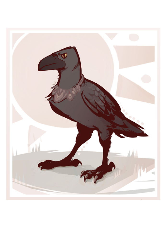
Raven character
highlight